
Doximity is hiring (see roles) — find out more about our technical stack.
Like many other software engineers, I enjoy a good data visualization. Most of the enjoyment comes from how easily our brains process what we see. In truth, we train our minds every day to extract meaning out of the colors and lines in our environment. That joy, of course, vanishes when inspecting a wall of text-based data like that of a test log. Without any useful cues anchoring us to our visual training, our brain will have to put in some serious mental effort to gather any useful insights, which is where visualizations come to the rescue.
Realizing the full value of one’s test suite, at its most basic, is an exercise in translating our available raw data into discrete visuals. This is true for whatever language we might be working in, but we’ll look at Ruby and RSpec for our examples.
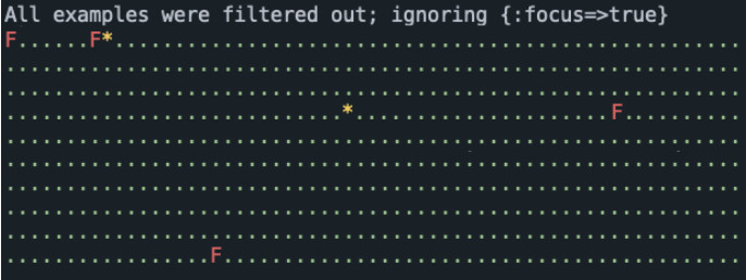
Here we run RSpec against a directory of tests, whose output produces some terse red-and-green pointillism. Nice! We have just exchanged a wall of text output for a wall of primarily green dots! Okay, not that impressive, but this is a fine place to start. We’ll call this our “primary” visualization layer.
If we look closer, there’s actually a lot of information packed into this simple example. The number of dots provides a relative quantity of tests run, passed, failed, and skipped. The relative cadence in which the dots were created is an indicator of performance (e.g., did the visual “pause” on a single dot?). What else can we learn from this? Oh, the delay at boot-time is an indicator of how much is loading beforehand. Hmm, maybe there’s more?
Let’s back up a step, and put some high-level boundaries on what makes up the aspects of a great test. I tend to agree with Noel Rappin in that a test should be SWIFT:
STRAIGHT-FORWARD (Is it obvious what the test does?)
WELL-DEFINED (Does it always pass when run multiple times by itself?)
INDEPENDENT (Does it always pass when run in combination with other tests?)
FAST (Does the entire suite finish in under 15 minutes?)
TRUTHFUL (Does it exercise the code base as intended?)
Secondary Visualization Layers
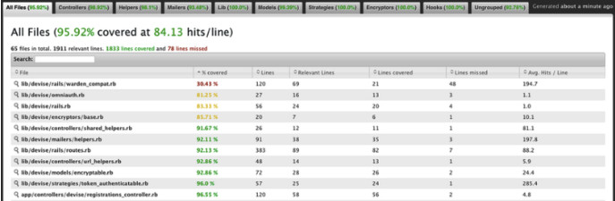
With a list of great test aspects, it should be a bit more clear that our red-and-green pointillism lacks insight into the “Straight-Forward” and “Truthful” categories. Granted, what is considered “straight-forward” might be in the eye of the beholder; there are still tell-tale indicators like the use of “and/or” within example descriptions, or a lack of lifecycle patterns within the test logic, like a classic AAA pattern: Arrange, Act, Assert (and the lesser-known fourth “A” I’d like to add ensuring cleanup — Annihilate! ). All to say, we still need a human to best determine if a test is STRAIGHT-FORWARD, and that’s okay since not everything is practical to chart. TRUTHFUL, on the other hand, stands a good chance to visualize with a code coverage tool. Simple Cov works great for this and answers our question as to whether the test actually exercises the codebase. We can consider this report, and ones like it, to be a “secondary” visualization layer.
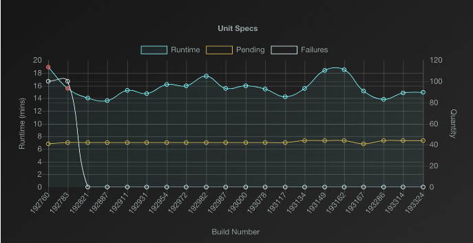
Let’s continue to add depth to our pointillism visual by examining what we can do to further visualize the FAST aspect of a great test. Here we might reach for Ruby-Prof, which helps visualize performance bottlenecks.
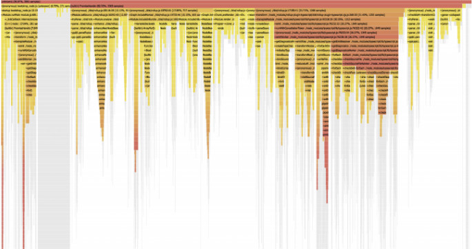
This gives us insight into the quality of our test suite performance in terms of software efficiency. Let’s pause here to contrast this with the quantity of test suite performance, which represents dedicated hardware resources. The two complement each other, but let’s be honest and admit that increasing parallelism or the resource_class (in reference to CircleCI) can be an “easy button.” Easy buttons tend to increase our costs, without proportionately increasing our value, so if increasing performance quantity is a temptation, see that as a prompt to also inspect your performance quality.
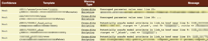
Security is along the outer-edge of visualizing various test aspects that we’ll touch on briefly. Security falls under TRUTHFUL, and Brakeman is a decent static analyzer for ruby. It’s far from perfect but helps visualize code security by way of ranking offenses via confidence and severity categories.
The Anatomy of a Test Suite Fire-Drill
If you've never had to partake in a test suite fire-drill, it goes something like this: "Hi,
Your CI pipeline is blocked, no developer can get a passing build, which means no changes can be made to your app, and your build history is becoming a wall of red. Gasp!
You have 2 options:
- Saddle up your steed and ride into the sunset with a "Welp, time to hit the ol’ dusty trail." (OR)
- Search through the build history, and find any commonalities. Then find the first instance of what looks to be the offending pull request.
Depending on how evident the fix will be, and if this is a best-case scenario, most solutions involve removing the offending test and fixing it before reintroducing it. Sadly, the negative effect on our developer workflow is prolonged, much like how a train engine goes off track sometime before the caboose is affected. Even after the fix is implemented, announcements have to be made in all relevant channels for everyone to merge or rebase master, etc. This is followed by a few more "Is anyone aware of this failure on CI?."
Time is of the essence. The faster a failure can be found and addressed, the smaller the consequences.
So how could we stop relying on polling slack channels, or getting pinged by developers? How can we make our monitoring proactive? I needed a better means of awareness. Something that provided the full picture.
Options Seem Limited
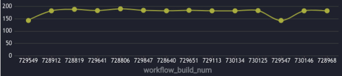
When I first began considering my options for visualizing our test suite concerns, I was disappointed to find how limited and expensive the tools were. In the case of CircleCI at the time, our highest available frequency for failure tracking was daily. A lot happens in 24 hours! I wanted to know exactly when a poorly defined or dependent test entered the suite, to avoid those train wrecks.
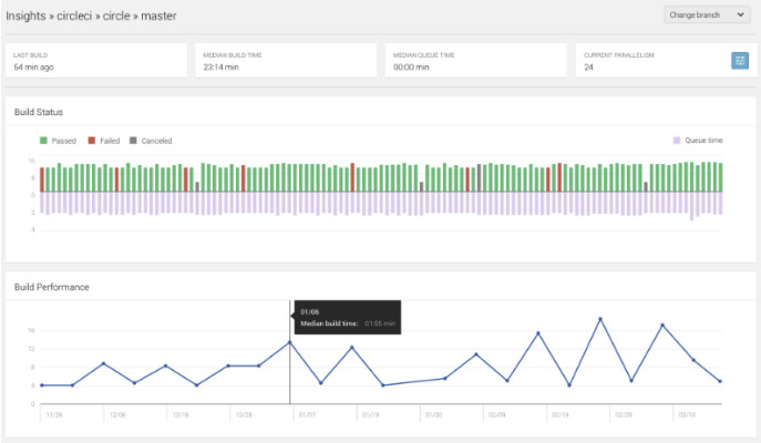
The above chart is a generic example, but its limits of granularity are clear. The vantage point is so high up, the viewer is only afforded 2 data points per day here in the case of build performance. To address issues the moment they enter the suite, I needed a report that could drill down to the level of real-time.
Custom Apps
Thanks to quarterly “Hackdays” hosted by Doximity, I set about building the kind of visual that would satisfy my real-time needs using react, rethinkdb, and a dash of chartJS.
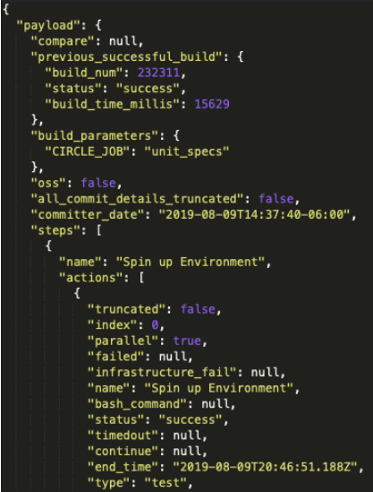
Each test run reported a JSON document to the app using notification webhooks, and each payload packed a buffet of data (around 4k lines!).
Each payload was then filtered for its most relevant data and used to produce each dot. The chart updated in real-time as each payload arrived, creating the effect of dots connected by Bézier curves marching across the screen. With everything laid out in time series, successive failures could often be correlated to a single pull request. If someone skipped a dozen tests, I would know right away, and each dot was linked to a specific build accessible at the click of a mouse. Very satisfying!
For a season, this helped cut down our latency on diagnose-and-fix tasks, while we worked to amend a rash of intermittent tests. Life was good. But over the course of using this tool, those unsophisticated third parties upped their game (and cut their costs). The maintenance of running a custom app began to manifest during this time as well — the feature details that needed refinement, the tests, the gem upgrades, the security concerns; they all needed to keep up with the standards of our in-house microservices. So before investing in a major update to our custom app, we re-visited the third-party visualization landscape.
Third-Party Providers
What we found was not the wasteland we expected, but a bounty of decent options that had since sprouted up and matured. Here are a few that we considered:
And to be fair, CircleCI has come a long way in providing not just a daily success rate, but also workflow duration, and credit usage charting along with their dedicated Insights dashboard. So kudos to them for their investment as they continue to build that out.
At the end of the day, we decided to go with Sumo Logic for our charting needs, since it hit the right mix of templates, customization, intuitive querying, ease of integration, and transparent billing. Not bad!
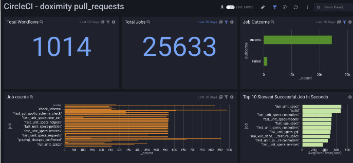
I can finally have my cake and eat it too. Look at this, I even have my Bézier curve presentation.
Primary vs Secondary Layers
The panels in our dashboard blur the lines a bit between primary and secondary layers, but I would suggest making the distinction based upon how derivative your metric is. For example, ask the question, “Can this metric be realized directly from the test runner, or does the test output need some post-processing?”
There is a caveat to this transition from custom app to third-party provider though, and some of it hinges on the fact that our crusade against poorly defined tests actually blunted the need for real-time accuracy. The highest level of granularity we get from our Sumo dashboard still requires a manual refresh. We can live with this because the fire-drills of the past (once every 2 weeks or worse) have been suppressed down to something closer to twice per year.
Without the need for a sharp focus on test failures, we can take a step back and monitor the broader picture, which comes with reduced granularity, but also reduced developer cost and very high reliability. Our team was freed to focus on what matters over maintenance. It also meant that it was time to bury our in-house tool 😿.
Conclusion
Whether your primary visualization is a custom app, third-party provider, or even just a simple field of dots , remember to first define what makes a great test. These aspects will inform your secondary layers, and serve as your guiding light for categorizing, prioritizing, and plumbing the depths of each test suite concern. Happy coding!
Be sure to follow @doximity_tech if you’d like to be notified about new blog posts.